Thursday, 8 May 2014
Broly ('Dragonball Z') Research and Final Piece Planning
The auras used in 'Dragonball Z' have always struck me as fantastical. In particular, the character, Broly, has some really elegant and majestic poses, which I think would work well in a 'Fantasy' photo-shoot.
For my final piece, I want to create a fantastical image which utilises inspiration from photographer I have researched, yet allows me to incorporate aspects of photography I enjoy the most. For me, "light drawings" are very fun and creative, as are photo-montages. Therefore, I am considering combining a Broly-like pose with the smoky effect of Stokkete, and the shrouded effect of Dmitrijs Bindemanis. Overall, I intend for it to look vaguely similar to Nejron Photo's work, but containing elements of my other artistic influences, and my own personal tastes.
Photo-Shoot #10
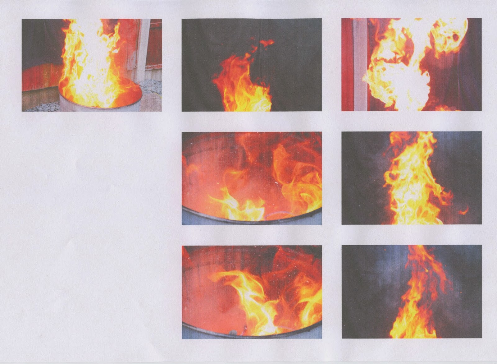
The main inspiration for this shoot was the work of Stokkete that I researched. The use of smoke in his images to build specific atmospheres is something I have been wanting to experiment with, so I made a fire in my back garden in a can in-front of black towels which I draped over a fence, then put a lid over the fire. Doing this allowed me to record the smoke protruding from the can without flames getting in the way. I feel that the footage of the smoke I recorded resembles the smoke seen in Stokkete's work at times, but also looks much different at times, too. This is good as it means that I can experiment with his look, and my own.
As for the footage and shots of the fire, I wanted to revisit the work I produced for Photo-Shoot #3. For that shoot, I captured images of my fireplace, which were digital flames. However, I thought that capturing footage and images of real flames would be better for achieving more "realistic" looks.
I recorded all of the footage in 60FPS in order to get really detailed images of the smoke and flames flowing in the air. 30FPS would have given me more "jumpy" footage, albeit the difference would not have been very great. The smoke and flames were moving very quickly, so 60FPS was the best choice to record the most accurate and detailed footage I could with my Canon EOS 7D DSLR.
Image #1 (Original Unedited)
I chose this image because of the natural form the flames took which resembles that of a creature, such as a dragon. The smoke surrounding it also looks like the "dragon" is breathing it out. The depth-of-field is wide, which will allow me to use the "dragon" as the subject.
Image #1 (First Version)
For this version, I increased the 'saturation' to the point of the flames becoming a reddish colour, which I consider to be more appropriate due to red being associated with death and danger. On top of that, I "cropped" the image to make the "dragon" cover the left side and the top, leaving the bottom-right corner empty for looking room. Not being able to see the background that was to the left of the "dragon" also helps to prevent people from looking at it like a regular burst of flames, instead of looking at the flames and seeing them for a dragon.
I really, really like this image, and the original. Taking this shot when I did was very lucky, which relates to Michael Yamashita's words, 'I'm paid to be in the right place at the right time' -- this is him saying that his job, for which he his paid, as a photographer requires him to be lucky with his shot timings.
Image #1 (Second Version)
Although I was satisfied with the first version, I wanted to experiment with the image some more because I like it so much. So, I used a 'soft eraser' tool, and the 'colour range' tool to remove the background entirely to increase the contrast between it and the flames. I decided then to decrease the 'saturation' of the flames slightly in order to make the image easier to look at.
In my opinion, this version ended up looking more like a dinosaur skeleton than a fire-breathing dragon. When I look at this image, I think of the 'Jurassic Park' logo, as I'm sure many others would, too. This could be a good thing as audiences might feel more comfortable with the image as it might seem familiar to them.
Photo-Shoot #9
For this shoot, I used some old models of 'Yu-Gi-Oh' characters as miniatures, with the intent of adding them into scenes from previous shoots. I captured some of the images with shallow depths-of-fields with the miniatures being out-of-focus to account for the focus on the part of the scene I plan to put them.
I will be using images from Photo-Shoot #7 and Photo-Shoot #3 as the scenes for these miniatures.
Image #1 (Original Unedited)
During this shoot, I decided to use this image (left) from Photo-Shoot #7 to be a scene in this 'Fantasy Medieval' experimentation because the fallen trees made good spots for a character to stand, the greenery looks conventionally fantastical, and the wider depth-of-field puts suitable focus on the fallen trees. I captured the image on the right with the intention of combining it specifically with the image on the left. I had the left image on my computer screen in-front of me as I captured the image of the miniature to help get the right angle.
Image #1
To create this 'Fantasy Medieval' scene, I "cut out" the miniature from its image, then imported it to the document of the landscape image, in Photoshop. Once imported, I decreased the 'saturation' of both 'layers', increased the 'contrast' of both, and positioned the miniature onto the tree. I then used a 'soft brush' tool with a lowered 'opacity' to create the look of shadows coming from the miniature, to make it look more "realistic" and like an actual part of the scene.
I really like the colours in this image as they have a very mellow and calm feel to them. The image looks rather peaceful and gentle to look at, as opposed to if it were made of reds and oranges, which would imply "danger".
Image #2 (Original Unedited Images)
I chose to use the first image (top-left), from Photo-Shoot #3, because it looks like what one would expect a 'Fantasy Medieval' battle scene with a dragon to look like. There is a bridge (the log) which the heroes must cross, with a dragon preventing them from passing. They can't go around because there is lava beneath them and fire surrounding them. They have no choice but to fight the dragon. This is what I thought of when looking at the Photo-Shoot #3 image, so, I proceeded to use miniatures to bring my idea to life.
I also chose to use the Photo-Shoot #10 image of the fire swirling in the can as it looks very well-defined and like it is moving quickly. It does a good job of creating the look of fire swirling around the characters.
On the one hand, I like the overall look of this image. The colours look very intense and "dangerous". However, on the other hand, I am somewhat dissatisfied with the miniatures. I do not feel as though they blend with the scene very well, particularly the dragon.
I enjoy making these intricate scenes, but I do not think I will develop this idea any further due to how time-consuming it is to make just one of them, and the inconsistency of quality.
Image #3 (Original Unedited)
Again, I chose the image on the left, from Photo-Shoot #7, because of the colours and greenery which make it seem lush and fantastical. I also chose it because of the framing of the waterfall and the cliff as putting a character at the top of it would give him/her looking room, making for a dramatic shot.
Image #3 (First Version)
In this first version, I put the miniature into the image of the waterfall, placed it at the top of the waterfall, used a 'soft brush' tool to add shadows on the character and around him, then lowered the 'saturation' and increased the 'contrast' of the character. I also decreased the 'saturation' of the waterfall image, and increased the 'contrast'.
I like this version, but, to me, the miniature did not look right with the background; it looked too "fake".
Image #3 (Second Version)
For this second version, I added a low 'opacity' green 'colour overlay' to the miniature in an attempt to make it blend with the background more. However, I still was not satisfied with the way it looked.
Image #3 (Third Version)
Finally, I reached a look that satisfies me. From the second version, the only change I made to achieve this look was adding an 'unsharp mask' to the miniature.
I do like this image as the green colours make the waterfall "stand out" quite well. The miniature stands tall and powerful at the top, as though embarking on an epic journey.
Miniatures Research
I am very interested in visual effects for film, and the history of them. When re-watching 'Star Wars' recently, I was admiring the use of miniatures for the starships, et cetera, in the original trilogy. This made me realise that I can use miniatures in still photography to create fantastical characters I would not otherwise be able to make.
Above is an image I found on Google Images whilst searching for still photography of miniatures. I found this one to be quite interesting as it uses the small size of the figures to make the strawberries look very large, whilst making the whole image look natural and "realistic".
For my use of miniatures, I am planning to capture images of figures, then "cut" those figures from their backgrounds and combine them with other images to create fantastical scenes, the likes of which people would expect to see in 'The Lord of the Rings'.
Wednesday, 7 May 2014
Photo-Shoot #8
I captured these images in my school's photography studio, under high-key lighting. The purpose of this shoot was to get images which I could then use to make a 'Sci-Fi Fantasy' scene with by combining them with images from Photo-Shoot #6.
My subject for this shoot was a globe of the Earth that I own.
Image #1
This image was created by combining an image from this shoot with one from Photo-Shoot #6. I chose this particular image from Photo-Shoot #6 because it is slightly out-of-focus -- when I was doing that shoot, I deliberately captured some out-of-focus shots of the landscape in preparation for having the focus on the planet. The hills in the landscape create leading lines going to the planet. With the Earth being seen in the sky, it implies that Mankind has migrated off of it to other planets. I really like this image, and it was fun to make; I now want to try combining a third image with these to create the look of a destroyed Earth.
In Photoshop, I used the 'quick select' tool to 'cut' the globe from its background, then positioned it to the left side of the landscape image. I then lowered the 'opacity' of the globe, and decreased the 'saturation' of both images. Finally, I "duplicated" the landscape image and put the duplicate version on-top of the globe 'layer', then decreased the 'opacity' of it.
I used an image from Photo-Shoot #3 (one of the lava-looking part of my fireplace) to create this effect. I really, really like this image. To make it, I imported the Photo-Shoot #3 image, positioned it over the globe, then selected the globe's shape and inverted it to delete the parts of the image that were not over the globe. I then decreased the 'opacity' of the fire image, and proceeded to increase the 'contrast' of everything. I also altered the 'hue' of the landscape image to give it a reddish tint.
I love how fantastical this image looks; it looks, to me, like something that would be seen in 'Sci-Fi' movies like 'Star Wars'.
Tuesday, 6 May 2014
Photo-Shoot #7
During this shoot, which I did in Wales, there were two rainbows going across a waterfall. This was quite a remarkable sight, and looked very fantastical. I decided to not only capture images, but also record video footage of this particular waterfall, as the still images could not show the fluctuating movements of the rainbows in the water.
Video #1
I chose to edit this video without combining it with any other videos or images because it already looks fantastical. Before this shoot, I had never seen anything like this before.
I chose to edit this one because the footage is steadier than the other two videos, however, it is still rather shaky. The reason for the footage being so shaky is because I did not have a tripod with me, and even if I had, I probably wouldn't have been able to use it very well due to the fact that I was standing on very bumpy and uneven rocks to get this view of the waterfall; I was struggling to stay standing myself. However, I do not think that the shakiness is all that bad. In this edited version of the video, which I edited in Adobe After Effects, I used the 'time stretch' tool to reduce the speed of the footage to about 200%, which made the shakiness look more like a first-person POV shot. Going with this 'POV' interpretation, it could be assumed that the person's who is looking at the waterfall is some kind of typical 'Medieval Fantasy' character, such as a knight, adventurer, wizard, et cetera. In After Effects, I also increased the 'saturation' of the footage quite a lot to make the greenery in the background look more "mystical", "magical", and lively. The framing of this footage is really effective as the waterfall and rainbow are positioned to the right side of the rule of thirds grid, thus making the rainbow act as a leading line to the vibrant green of the cliff-side in the background.
Overall, I am happy with this video. It is not my favourite piece of work, but I really like how beautiful it looks, and the fact that I did not need to combine the footage with anything to make it look so.
Photo-Shoot #6
I captured all of these images on the top of a hill near to where I live.
I decided to not edit any of these images on their own, as they were all taken with the specific intent of combining with images from a future shoot, and none of these landscape photographs would look very fantastical on their own.
When I conduct the shoot of the globe, I will put the combined images on the post of that photo-shoot instead of this one.
Subscribe to:
Posts (Atom)