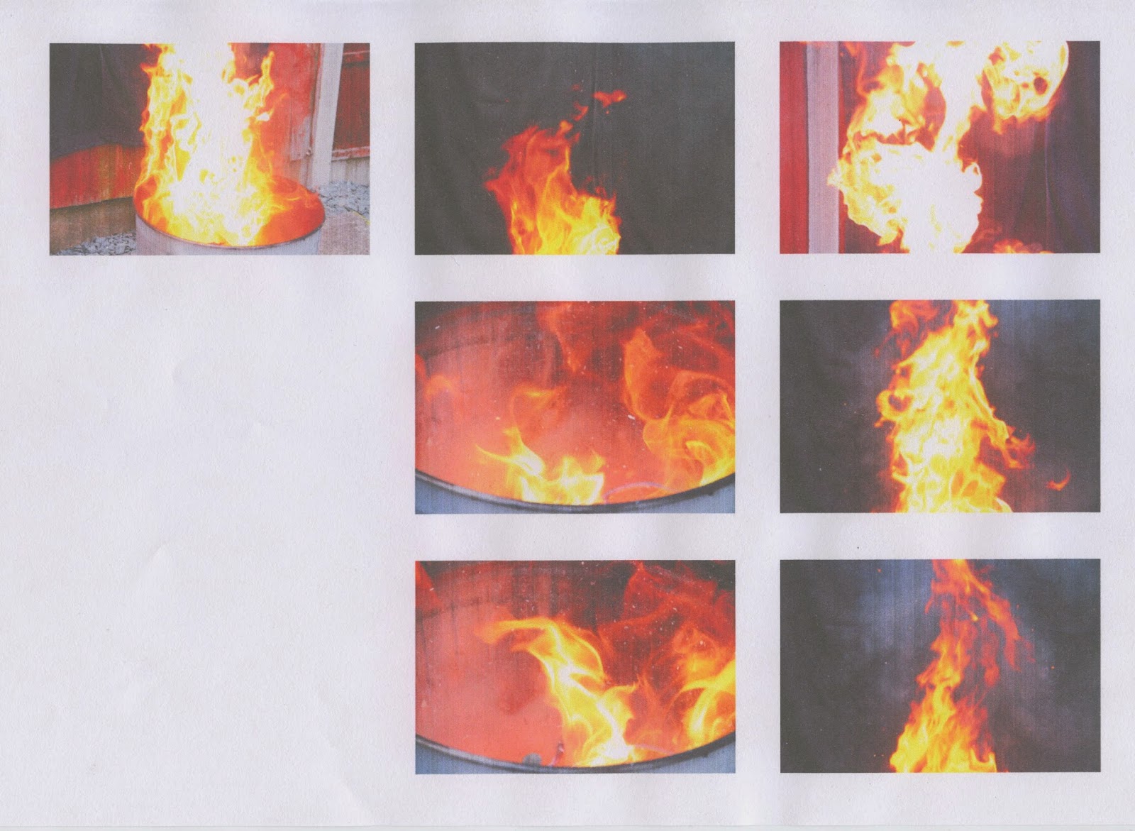
The main inspiration for this shoot was the work of Stokkete that I researched. The use of smoke in his images to build specific atmospheres is something I have been wanting to experiment with, so I made a fire in my back garden in a can in-front of black towels which I draped over a fence, then put a lid over the fire. Doing this allowed me to record the smoke protruding from the can without flames getting in the way. I feel that the footage of the smoke I recorded resembles the smoke seen in Stokkete's work at times, but also looks much different at times, too. This is good as it means that I can experiment with his look, and my own.
As for the footage and shots of the fire, I wanted to revisit the work I produced for Photo-Shoot #3. For that shoot, I captured images of my fireplace, which were digital flames. However, I thought that capturing footage and images of real flames would be better for achieving more "realistic" looks.
I recorded all of the footage in 60FPS in order to get really detailed images of the smoke and flames flowing in the air. 30FPS would have given me more "jumpy" footage, albeit the difference would not have been very great. The smoke and flames were moving very quickly, so 60FPS was the best choice to record the most accurate and detailed footage I could with my Canon EOS 7D DSLR.
Image #1 (Original Unedited)
I chose this image because of the natural form the flames took which resembles that of a creature, such as a dragon. The smoke surrounding it also looks like the "dragon" is breathing it out. The depth-of-field is wide, which will allow me to use the "dragon" as the subject.
Image #1 (First Version)
For this version, I increased the 'saturation' to the point of the flames becoming a reddish colour, which I consider to be more appropriate due to red being associated with death and danger. On top of that, I "cropped" the image to make the "dragon" cover the left side and the top, leaving the bottom-right corner empty for looking room. Not being able to see the background that was to the left of the "dragon" also helps to prevent people from looking at it like a regular burst of flames, instead of looking at the flames and seeing them for a dragon.
I really, really like this image, and the original. Taking this shot when I did was very lucky, which relates to Michael Yamashita's words, 'I'm paid to be in the right place at the right time' -- this is him saying that his job, for which he his paid, as a photographer requires him to be lucky with his shot timings.
Image #1 (Second Version)
Although I was satisfied with the first version, I wanted to experiment with the image some more because I like it so much. So, I used a 'soft eraser' tool, and the 'colour range' tool to remove the background entirely to increase the contrast between it and the flames. I decided then to decrease the 'saturation' of the flames slightly in order to make the image easier to look at.
In my opinion, this version ended up looking more like a dinosaur skeleton than a fire-breathing dragon. When I look at this image, I think of the 'Jurassic Park' logo, as I'm sure many others would, too. This could be a good thing as audiences might feel more comfortable with the image as it might seem familiar to them.


No comments:
Post a Comment